
Lectures > Laying it all out there: When a good looking layout is actually bad
Laying it all out there: When a good looking layout is actually bad
Excellent article by the people over at Boom Box Post about organizing our sound post sessions to make our lives more simple (and productive).
Over the past year, Jeff has written two excellent posts on sound effects editorial layout: Downstream: Valuable Sound Designers Think Like Mixers and Speak Volumes Through Well Organized Work. He's laid out the golden rules of sound editorial layout in an easy-to-follow manner, and I highly recommend reading both posts before this one.
But, even the clearest rules can be misinterpreted and scenarios that seems like exceptions can often arise. Even the most seasoned editor will encounter situations where he or she will wonder, "How do I know if this is the best layout?". Here, I want to address some common pitfalls that I've seen and help you to solve them.
THE GOLDEN RULES
First, let's get the golden rules out of the way. Here they are in a quick checklist.
- KNOW WHICH TRACKS YOUR FX SHOULD LIVE IN: MONO FX, STEREO FX, AMBIENCES, OR BACKGROUNDS.
Mono FX should be used for an on-screen action in a specific location, stereo FX should be used for something you want to spread for dramatic purposes or to convey the all-encompassing nature of the sound (like an explosion). Ambience tracks should be used for imagined off-screen environmental sounds (like a phone ringing that we never see) or environmental steadies that do not last for the full scene (like a rainstorm that comes and goes). Backgrounds are for imagined general environmental sounds that establish a location and are steady throughout a scene. - STAIR STEP YOUR BUILDS.
This means you beginning cutting in your top FX track and as time passes, you cut each new sound on the next track down. - FOOD GROUP YOUR BUILDS.
You may be given food group tracks in your template or asked to split out certain elements (like, say, a helicopter that comes and goes throughout an episode). Keep all sound effects for that element in the food group track. - CUT IN PERSPECTIVE.
If you're cutting any steady elements in the FX tracks or ambience tracks, be sure to checkerboard them with appropriate fades each time the distance between the subject and camera changes (notice that I didn't say each time the shot changes). - COLOR CODE YOUR ELEMENTS.
All sounds for the same build should be the same color. This makes them easy to find in the mix. - KNOW WHEN TO USE CLIP GAIN AND WHEN TO USE VOLUME GRAPHING.
Clip gain should be used for balancing within a build, volume graphing should be used for perspective shifts and backgrounds.
THE TEST
Now for the tough love: Just because your session looks pretty doesn't mean that it is well organized. Here are three questions that you need to ask yourself after organizing your work. If the answers aren't "yes," then you need to rethink things.
- Will it be easy for a mixer to adjust the volume and panning on a console?
- Will the mixer be able to balance all of the elements that make up a build in one pass?
- Will the mixer know which elements belong to each on-screen action without soloing the files?
COMMON PITFALLS
And now for a few examples of layouts that look good but are actually very bad.
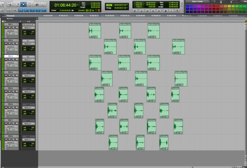
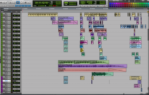
THE UNNECESSARY STAIR-STEP
Incorrect Use of Stair Stepping
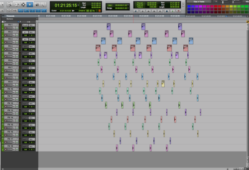
Correct Grouping & Color Coding
This incorrect layout is the epitome of not fully understanding the golden rules. I know, rule number four tells you to stair step (although this is also not a true stair step, even if it were appropriate). But, if you look closer, I said "stair step your builds." In the first photo, all of the sound files you see are actually covering the same thing: golden apples landing on the ground. Only two audio files were used: one file was cut into pieces and used on tracks 1-4, the second file was cut into pieces and sprawled across tracks 5-18. The idea of stair stepping is that it helps the mixer by separating files which are vastly different from one another on the timeline, allowing him or her the time to move from one to the next on the console. You do not need to cut up a single file and stair step it across numerous tracks. That actually makes it harder to mix.
When you look at the solution, you can see that it solves all three test question issues which it failed the first time around. The same files have been kept on the same tracks with one another, but are spread out just enough to allow each element to sync properly to picture without overlapping the last. This one can be mixed by just one hand (four fader fingers!), and definitely passes the single pass test. Furthermore, it was unclear from looking at the first that all elements were covering the same on-screen action. Now, thanks to the clear grouping and color-coding, it's easy to tell that all of the files are covering the golden apples.
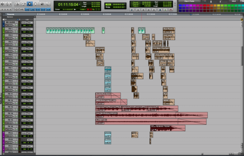
The Partial Perspective Cut
Incorrect Perspective Cutting
Correct Perspective Cutting & Color Coding
This situation honestly baffles me, but I often see multiple elements covering that same thing which are perspective cut in different ways. If you look closely at the first picture, you'll see that the animal vocals are correctly cut in perspective. However, the first two elements (the debris of the stampede) are not cut in perspective at all. The last two elements (also covering the debris of the stampede) have been cut in perspective, but not shifted onto separate tracks (a big no-no!) and clip gain was used on adjacent regions (also a huge no-no!).
This layout fails all of the three tests, too. It cannot be easily adjusted for different panning and volume since not all elements are split out properly for perspective It will take more than one pass on the console since the clip gain of the lower regions must be undone on the computer before even beginning. And, it appears that all of these elements are covering different things since they are not cut in the same fashion or color coded. This means the mixer will likely have to solo them all to even tell what he/she should address.
The corrected photo solves all of these problems. The animal vocals are color coded orange and the debris is colored brown. All elements have been checker boarded in perspective with correct fades, and all clip gain has been converted to volume graphing. Further, the volume graphing changes have been changed to be the same for all elements. After all, we are either closer or father away from all elements. We can't be closer to just a few.
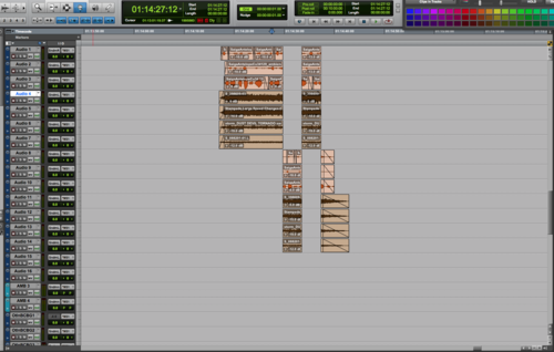
THE RANDOM CHECKER-BOARDING
Incorrect Grouping
Correct Grouping
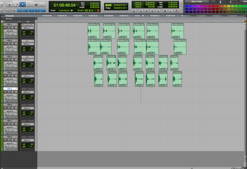
This is another form of unnecessary spreading that actually confuses, rather than helps, your mixer. In this example, four characters were walking through the mud, and the editor used two mud squish files to sweeten the footsteps. So, why are we spread across eight tracks?
The solution is to put each character's mud squishes on the same track. So, we are left with four tracks. Each track has individual steps (cut from the same file) which are in sync with the picture. This can now be mixed in one pass.
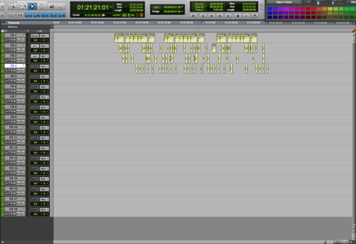
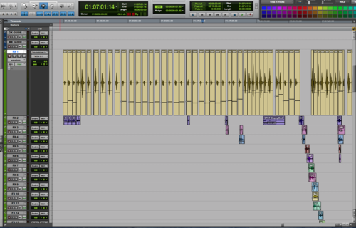
THE CLUSTER
Incorrect Stair Stepping, Color Coding & Use of Tracks
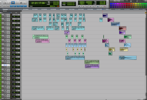
Correct Stair Stepping, Color Coding, Full Use of Tracks
Here we see an example of someone who did a partially good job. But, there are still major issues. Some elements are color coded while others are not, elements covering the same thing are not grouped together, and worst of all, we are not using all of the tracks available which means we have elements too close for comfort for the mixer.
In the corrected example, you can easily tell which files are covering the same on-screen actions by their color coding. I've also spread them out to fully use the track count provided. You'll notice that I didn't use the last three tracks. That's because the rule is that we stair step builds, not files. We always want to group builds together. So, since I didn't have enough tracks to accommodate the entire pink build, I started it again at the top rather than splitting up elements.
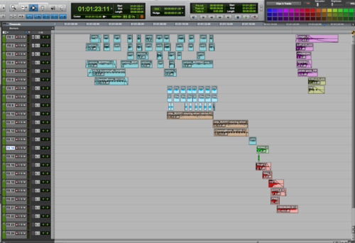
THE RAINBOW EFFECT
Incorrect Color Coding
Correct Color Coding
Although several of the above examples addressed color-coding along with other issues, I wanted to show one sole example of this. Here, the first session is a mess. As a mixer, there is no way to tell which elements are covering which on-screen action. Which builds are the stereo elements a part of? If a client said "turn down the mud," how would the mixer accommodate without soloing everything individually or scooting over to the computer screen and weeding through file names?
In the second example, even though the layout is not great (I left it this way to show exactly how important color coding alone can be), we can still tell which elements belong together at a glance. If asked to turn down the wing flaps, it would be easy to see that they are the topmost green element. Now, the two extra flaps in the midst of the brown section won't be missed on that note. The mixer will know to grab those as well.
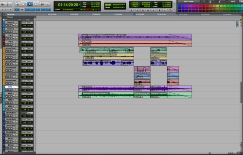
THE CLIP GAIN MANIA
Incorrect Use of Clip Gain, Lack of Perspective Cutting
Correct Use of Fades, Perspective Cutting, and Volume Graphing
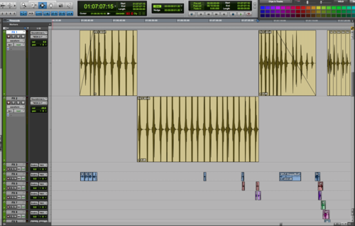
Clip gain was a game-changer for many of us when it was first introduced to ProTools. However, you need to know when to use it. It should never be used in lieu of fades (by clip gaining each individual element up or down as time passes), or be substituted for correct perspective cutting. I showed the clip gain line view on the first photo so that you can see how much work went into adding clip gain to these wing flap sound effects. Unfortunately, all that hard work actually made it harder for the mixer to do his/her job.
In the corrected example, I have removed the clip gain, consolidated the region, and then cut it in perspective, adding a fade in and out and volume graphing to accomplish the volume change in perspective shifts.
Comments (7)
Rick S (3 hours ago)
Is it possible to receive the photos in a more hi-res format, to really be able to analyze the track layouts?
Thanks again for an amazing article!
Jordan Wilby (17 hours ago)
Great list, thanks. I would add "talk to your mixer" as part of the golden rules, as s/he will give you their preferences regarding all of the above, enabling them to hit the ground running straight out of the gate (i.e. mixing instead of fixing). In my experience no two mixers are alike in regards to some of these details, and you'll make everyone's life a lot easier if you know ahead of time if they like color coded clips (or not), if their mix tech zeros out your volume automation upon initial import (or not), etc. Pre-project convo with the mix tech/recordist will work wonders for getting ahead of a lot of up front problems as well.
Paul Fonarev (2 weeks ago)
Really solid set of guidelines for editors!
In addition to color coordinating like elements in PT, do you ever rename tracks that contain common repeated elements (i.e. BOOM 1, 2; WHOOSH 1, 2) for your mixer? Or does perspective cutting of those elements result in way too many tracks if you do it that way?
Boom Box Post (2 weeks ago)
Hi Paul! Thanks for reading! This is an excellent question. In golden rule #3, I suggest food grouping your builds, which is exactly what you're asking about. A food group is a group of tracks which are designated only for specific sounds or events and then named accordingly. We often split out whooshes, pats, or vehicles onto designated tracks. But, be sure that when using food groups you still keep builds together. For example, if you create a custom whoosh that contains an actual whoosh, a tiger roar, a flame blast, and a sword shing, all of those elements should live together in your whoosh tracks rather than spread out across several different food groups. As I said in the post, always food group your BUILDS, not your SOUNDS. If they all make up a whoosh, they all belong in the whoosh tracks regardless of which individual sounds you used.
Kyle O'Connor (A week ago)
I guess I'm still a little confused of the difference between food groups, builds, and designated tracks. I get what you mean by a "food group" (i.e. all the sounds that make up one helicopter grouped together), but when you say that they belong on "designated tracks," do you mean their own, completely new tracks set apart from whatever generic SFX tracks you have, or just all color-coded the same? You say, "always food group your BUILDS, not your SOUNDS," but isn't a food group just a build anyway? Just need help on your terminology.
Thanks!
Boom Box Post (A week ago)
Hi Kyle, thanks for your questions! I have a feeling if you're still a bit confused that many others are as well. So I appreciate the opportunity to clarify things. Here are a set of definitions (my own) for the terminology I use in this post:
- food group: a set of tracks designated to hold builds for a particular thing. Example: Helicopter FX 1-12.
- designated tracks: tracks that have been designated to hold builds for a particular thing (see #1--this is the same thing as a food group).
- builds: a group of sounds that together cover one object or action. Example: the 4 sound effects that make up the sound of a helicopter flying by (perhaps a doppler heli blade wop, a doppler helicopter engine by, a whoosh, and a gust of wind).
- sound/sound effect: One sound file that either covers an on-screen action or event. This may stand alone or be a part of a greater build (see #3)
Ellis Burman (2 weeks ago)
Fantastic! Thanks for this! This should be required reading, especially for picture editors that are also cutting FX.